Deevoted
Identity, Website

GOALS
Deevoted came back to us after engaging us to come up with a new design for an eCommerce project of one of their larger clients. After the success of its initial review we were trusted with the freedom to create a brand we thought fit best with the people, their services and the name — Deevoted LLC. The goal was to create a new identity together with business cards, letterheads, pitch deck and white paper styling, style guides, and responsive web designs.
We delivered a handful of concepts for the identity. It quickly became apparent what colours best fit with the identity to represent the brand’s commitment to its clients. From there, it was a matter of fine tuning and getting cracking on the style guide which quickly led into more assets being added to our scope, including a new web design.


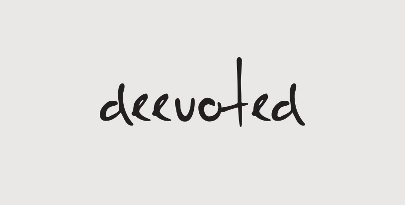
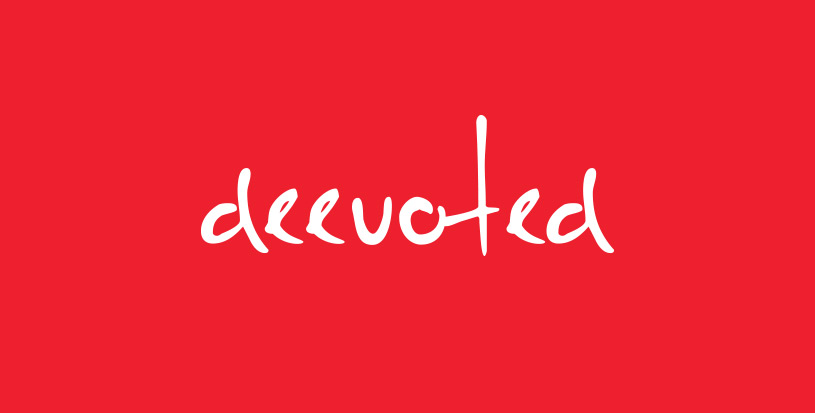
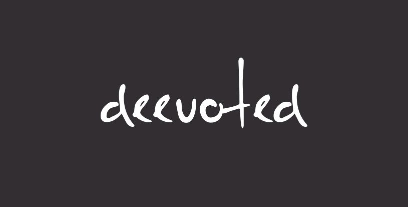
With a hand-written wordmark we give a personable dimension to the brand. We show that there are people behind it who are personally invested in the work. There’s no hiding behind cold, corporate facades. Hand-written type shows off quirky and extensive creative potential. Lowercase letters hint at an understated sense of confidence in the work delivered without the need to shout it out.
Further, the regular & bold lettering suggests that Deevoted is here to stay, emphasized by the quick and decisive strokes, and the height of the letter “t” suggesting that you fight for what’s yours and hold your own. As a viewer you can imagine the sense of loyalty and devotion the brand has with its personal touch.
The circle represents full-service client commitments. The triangle represents technology. The squares have multiple components as part of the projects. The infinite loop is made up of three elements: the client, the team, and the project. In the end, people feel comfortable with the circle and both intuitively and subconsciously know the meaning: a devoted connection.

Credits
- Creative Direction & Design Wild Forest, Inc.


