Guns of Purgatory
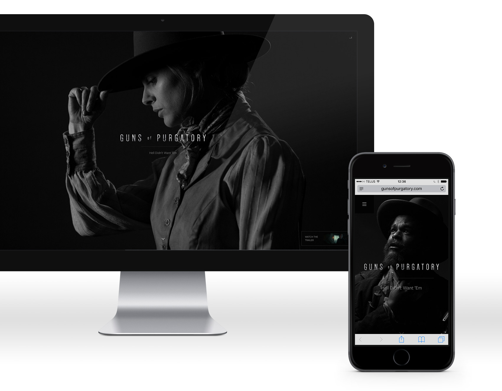
Identity, Website
GOALS
Being in at the ground floor, literally, on a short feature film project, helps keep the vision of everyone on the team cohesive.
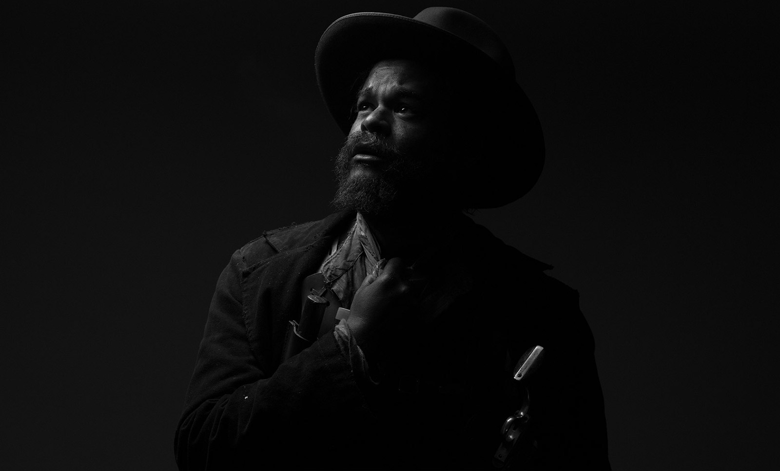
After reviewing the script, mood boards, and having an in-depth conversation with the director, Brock Davis Mitchell, it became apparent that the story could take place in present-day but was being set as a period piece. As such, we wanted to deliver something more timeless. From the beginning, color was stripped from the equation due to the dramatic and dark essence of the story. A few identity sketches in and it was time to focus on textures and getting cracking on the style guide and website.

After the successful completion of deliverables for Guns of Purgatory, the weekend before the big reveal, production companies behind the short asked to create new looks for themselves that would compliment the Guns of Purgatory logotype.
First Degree Films / Rocky Mountain Productions animation sequence
The wordmark’s wider-than-usual letter-spacing suggests there is room for the viewer’s own thoughts to connect the dots in relation to the story. The capitalized and tall lettering touts that there is standing-room only, providing a glimpse into the significance, guts, strength, and pride of both the story and its characters.
What was once standing tall has become scratched up with the textured lettering, breaking down the strength a notch by showing both physical and emotional vulnerability all the while hiting at the turmoil the story’s characters live through.
